I think that the combination of the tremendous possibilities of Deneb and Power BI's DAX measures can tackle almost all data visualizations challenges for this reason I lean to Deneb whenever an extra twist is needed in my data visualizations for quite some time.
The other day, a simple stacked bar chart was required. A stacked bar chart is nothing special, but I needed to visualize two extras: a tick representing a target value transforming the bar chart into a stacked bullet chart, and the second extra a discrete color scheme for the segments (no more than four form a stack), next to this requirement it was also required that negative values are colored with a 30% transparency or an opacity ot 70%.
This article can be considered a sidekick of my previous article “The (better) rectangular pie chart” that you can find here: https://www.minceddata.info/2023/11/12/the-better-rectangular-pie-chart/
This article is about how to pass the colors to be used as a measure. If you are familiar with Deneb then you know that color is visualized automatically because color is considered a scale.
The table below shows the values and the color that will be passed to Deneb:

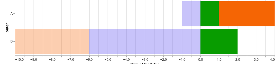
And the next picture show a screenshot of the Deneb data visualization:
Because sometimes it’s more simple to adapt the DAX measure than the Deneb specification; the colors are passed to Deneb as a measure. The next code snippet shows the DAX measure that determines the color:
theColor =
var theInnerValue = SELECTEDVALUE( 'Table'[inner] )
return
SWITCH( theInnerValue
,"I" , IF( CALCULATE( SUM( 'Table'[theValue] ) , 'Table'[inner] = "I" ) > 0 , "#079c02" , "#079c0250" )
, "II" , IF( CALCULATE( SUM( 'Table'[theValue] ) , 'Table'[inner] = "II" ) > 0 , "#f56505" , "#f5650550" )
, "III" , IF( CALCULATE( SUM( 'Table'[theValue] ) , 'Table'[inner] = "III" ) > 0 , "#5041f0" , "#5041f050" )
)
To use the colors from measure is simple, as always when we know how something works.It took me some time and repeatedly reading of the scale doucmention of vega-lite, then after reading this the third time (maybe the fifth) I stumbled across this sentence
To directly encode the data value, the
scaleproperty can be set tonull.
Okay, okay, it took me some time to really understand that sentence but then it was simple, now the spec that holds the definition of the color in the encoding section of the spec is simple as this:
"color": {
"field": "theColor",
"type": "nominal",
"scale": null
}
Because the scale property is set to null the values of the field theColor is used to provide the color for the segments.
I think this little hack will be handy on many occasions, this is the reason why I created this article.
Here you will find the pbix: https://tommartens-my.sharepoint.com/:u:/g/personal/tom_minceddata_com/EdScWFuXfQdPtBz74LkD9GwB1EmmfIrwFB_R1bxC5YnA5g?e=hHfTyR
Probably you will wonder why there is no data labeling, data lableing for stacked bar charts is not that simple, I will enhance the data labeling “approach” from the article I referenced above, but this has to wait a little.
Thank you for reading.
Kommentar schreiben