Data Visualization
Data Visualization · 03. März 2024
I think that the combination of the tremendous possibilities of Deneb and Power BI's DAX measures can tackle almost all data visualizations challenges for this reason I lean to Deneb whenever an extra twist is needed in my data visualizations for quite some time.
Data Visualization · 19. Dezember 2023

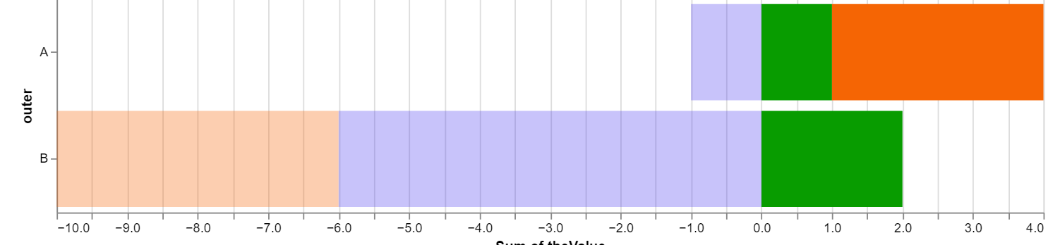
Most of the time, when creating a stacked bar or column chart, my focus is the total value of the stacks, not the comparison of the segments across stacks. Ordering the segments by value still allows us to easily spot differences in the importance of segments across the stacks.
Data Visualization · 12. November 2023
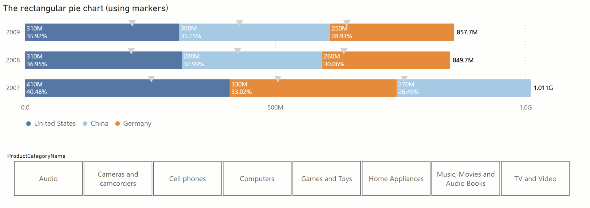
Using Deneb helps to add the visual hints of a pie chart to a stacked bar chart.
Data Visualization · 16. Mai 2022
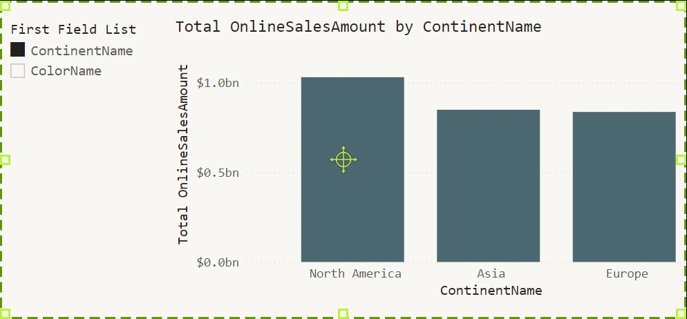
Field parameters allow the report designer to switch the content of a visual with ease. This feature allows the report consumers to interact with data without needing to create their reports
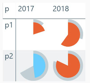
Data Visualization · 03. April 2021
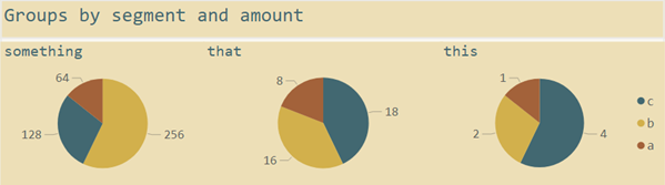
This blog is about one visualization task. In particular, this task is called part-to-whole. Effective visualizations will reveal the contribution of a single item to the whole, as Claus Dieter Wilke calls this in his book "Fundamentals of Data Visualization": "… visualizing proportions … as part of the total." and how this task can be solved using Power BI, now and even more important in the future.
Data Visualization · 22. September 2020

How to display the Total data label in Power BI the - the new way!
Data Visualization · 12. August 2018
Using svg graphics to create information dense data visualizations often called microcharts or sparklines using the table and matrix visual in Power BI.