The September 2020 release of Power BI Desktop once again comes with a ton of features. Maybe the most important thing is that the “Store datasets using enhanced metadata format” is no longer a preview feature - it’s GA now.
But sometimes it’s the small things that get us excited, at least gets me excited. For this reason, I’m trying to direct your attention to this new feature, or as I would say, this capability.
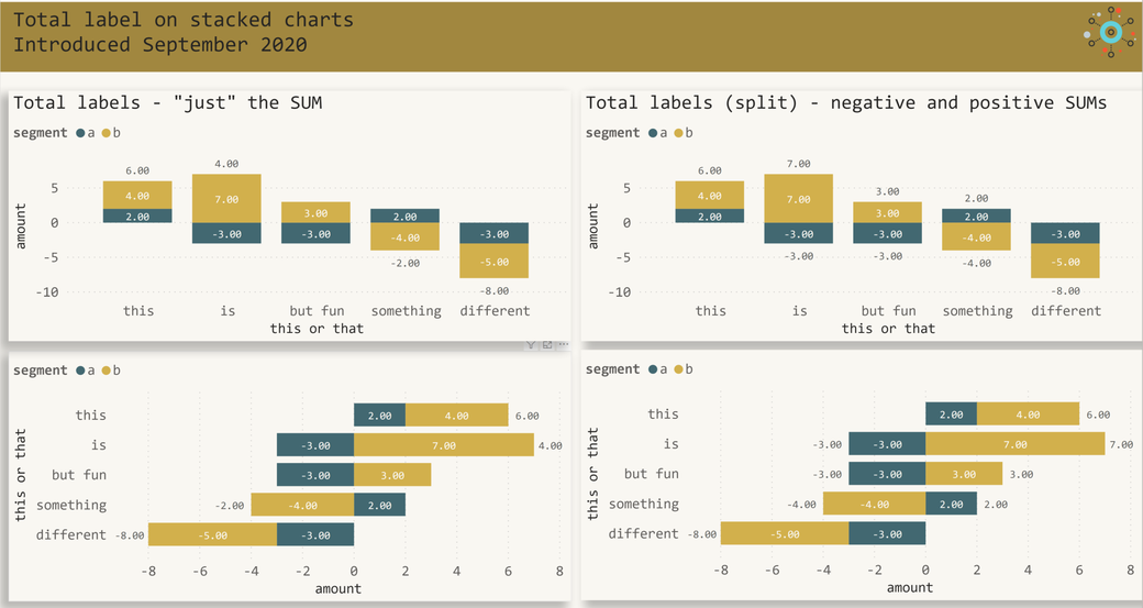
If you are wondering what I’m talking about, Stacked charts now support the Total label. Until now, we haven’t been able to create a stacked bar chart that also displays the total sum like this:
To be honest, we have been able to create a chart like this, just by using the Line and stacked column chart visual, then changing the width of the line to zero and displaying the data label. There are some excellent videos and blogs available that explain how to achieve the above in great detail.
Unfortunately, this trick only works if all the values are positive. As soon as one segment value is negative, this trick does no longer work. The explanation of why this trick fails is simple. The easiest way to explain this is by using another screenshot.
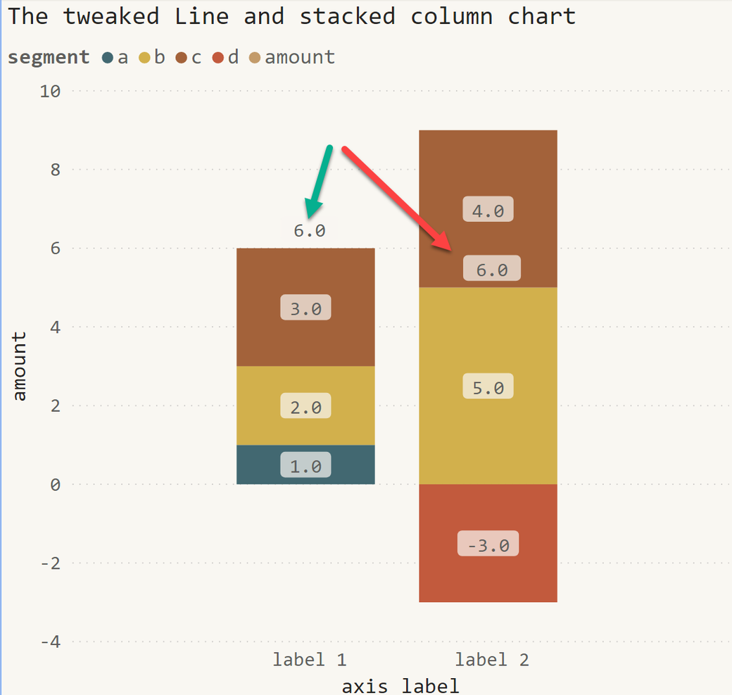
As you can see on the screenshot above, the Total of label 2 across all segments is placed somewhere in the column. Even if the placement is technically correct, the readability of the chart becomes a nightmare. The explanation of why this happens is simple: the value itself determines the data label's position.
In the past, I had to overcome this issue by creating script visuals using Python or R.
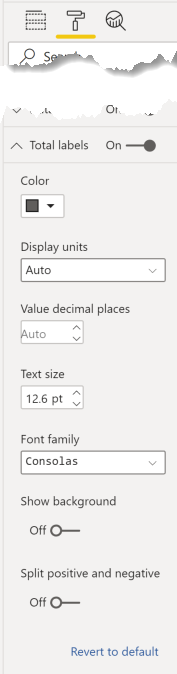
But now we can use the formatting option on all stacked chart types. The next screenshot shows the new formatting property Total label:
Kommentar schreiben