Data Visualization · 22. September 2020
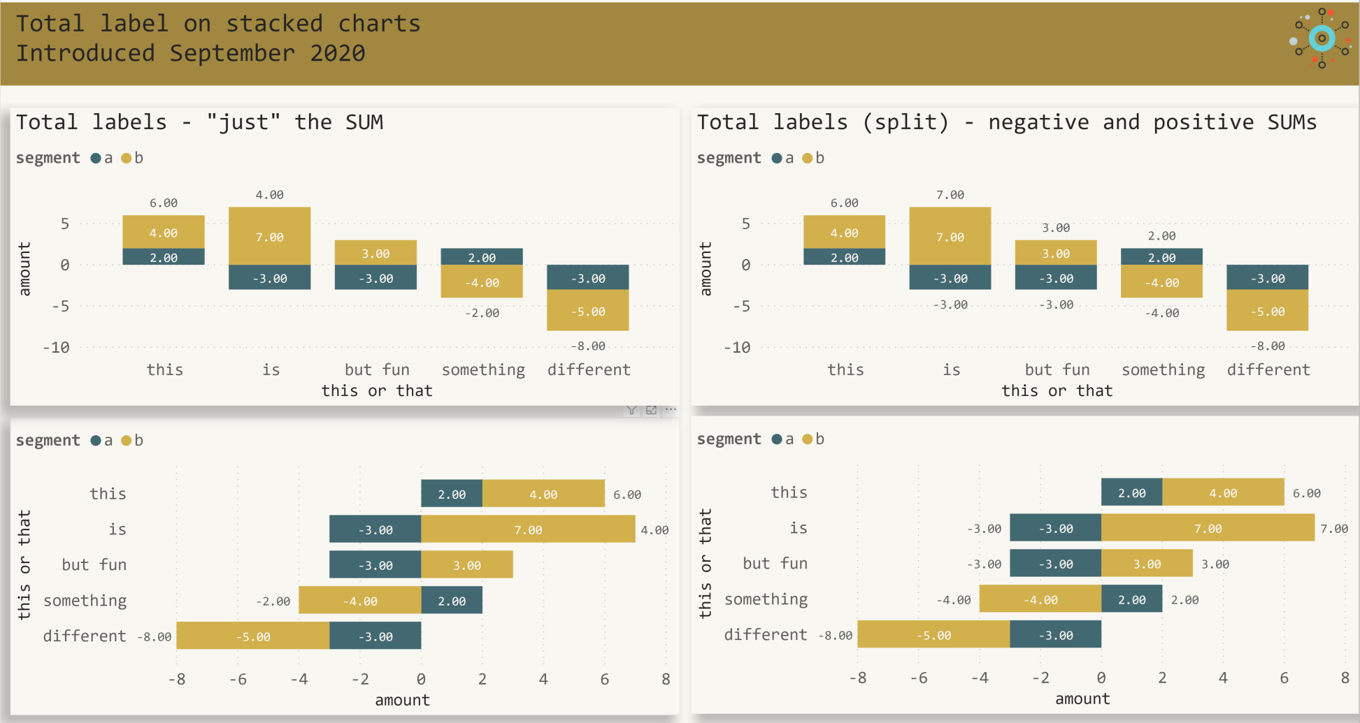
How to display the Total data label in Power BI the - the new way!
DAX · 04. März 2020
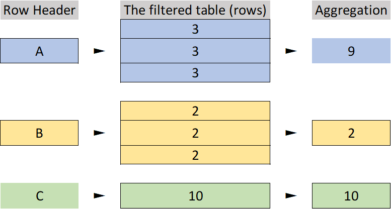
This blog provides an introdution into some universal truths, of course things like evaluation context, or data lineage will be mentioned
Data Visualization · 12. August 2018
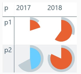
Using svg graphics to create information dense data visualizations often called microcharts or sparklines using the table and matrix visual in Power BI.
Power BI · 30. April 2018
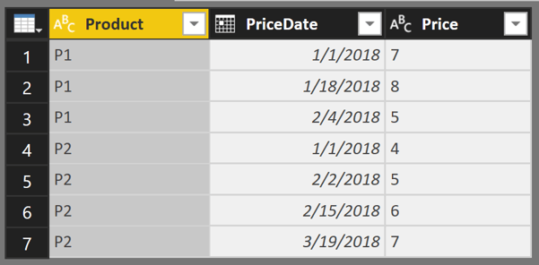
This article is the starting point of a series of articles that demonstrates how to navigate through tables inside a Tabular Model, from Microsoft Analysis Services Tabular, Power Pivot or Power BI using DAX
Power BI · 25. Februar 2018
Using Power BI, Azure SQL, Microsoft Flow to analyze what's going at SQLKonferenz 2018


