There are a lot of possibilities to visualize your data if you are using Power BI. You can use one of the numerous built-in chart types, use one of the custom build visuals that are available from the market place called app source, and you also can develop your own visuals using javascript or R. With the release of Power BI Desktop two new possiblities to visualize ones data are available:
- Python (currently Python scripts are in preview and are not supported on the PBI service)
- One now can assign the data category "Image Url" to a measure
From a data visualization point of view I'm more excited about the 2nd option, than about the addition of Python to the toolstack.
Assigning the data category "Image Url" to a mearsure opens up new possibilities to create measures that return a simple text string where the text represents an svg image. If you are not familiar with svg images,
this will get you started: https://en.wikipedia.org/wiki/Scalable_Vector_Graphics
Here you will find
extensive tutorials: https://developer.mozilla.org/en-US/docs/Web/SVG/Tutorial
What I love about the usage of svg next to the other options for data visualization is the simplicity with wich svg charts can be used. They do not extensive knowledge of a programming language like JS, R or Python (I'm pretty sure, that some consider the composing of svg charts also as some kind of programming :-) ). Another great advantage is that they just can be used inside the Power BI table and matrix visual, without any dependencies to other programming environments.
I have to admit that I'm quite excited about the possibility to use svg charts from inside the table and matrix visual. This easily allows to create microcharts and small multiples.
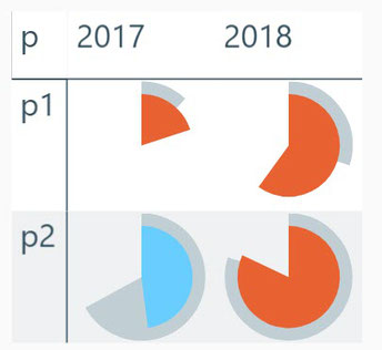
In this post (it's more than likely that this will not be my last one) I use 2 percentage values to create layered segments of a pie.
This kind of visualization is called "Harvey Ball".
From my point of view a slice is one of the ideal forms to represent a percentage (a part of the whole), this is due to the resemblance of an reduced watch dial the accompanying pbix file contains a lot more information
The underlying data is sample data, where project performance is measured by 2 values:
- Percent completion and
- Time spent
"Percent completion" represents how much tasks have been accomplished and "Time spent" reflects how much time has been spent, here the percentage reflects the actual spent time in comparison to the planned time. Basically it's better if more tasks are completed in less time. "Red" segments are shown when more time is spend than planned:

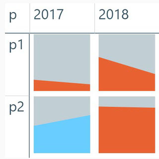
I also created an angular version of the Harveyball chart from above. I call this version Harveybox. Here I use the "cost" measure "Time spent" on the left side from the box and the "revenue" measure "percent completion" on the right side. This leads to a rising line that symbolizes "success" in many societies, whereas a slopy line often symbolizes failure:

I hope you will find this useful and maybe you get as excited as I am.
Cheers,
Tom
Kommentar schreiben