One of the most requested features (at least from my perception) has arrived with the May 2022 release of Power BI desktop. This feature allows the report designer to switch the content of a
visual with ease.
As one picture can communicate a meaning better than a thousand words, the following picture shows what is meant by changing the content of a visual:

The above gif shows how the content of the axis changes depending on the selection in the slicer.
This is exactly what the new feature allows us to create: a list of fields (basically, this list of fields is a table created in the dataset). The list can contain columns and calculated columns or measures. At the time of this writing, only explicit measures are supported.
In the past, different solutions have been created by the community to fulfill the requirement of report users being able to change the content of a data visualization easily. Changing the content of a data visualization means (the list is not complete ;-) ):
- Changing the content of the x-axis of a column chart, e.g., from product color to continent, as demonstrated in the animated gif above
- Changing the content of a legend, meaning splitting the value into an additional category as in a stacked or clustered column/bar chart
- Changing the numeric value, the measure, the Kpi (however you call this field type) used to compare items, show a trend across a timeline, visualize the contribution of a part-to-a-whole, and all the other things we do inside Power BI.
The solutions depicted here had a downside. Using bookmarks makes the report design more complex and, for this reason, harder to maintain. All of these solutions either had to make exhaustive use of the bookmark feature, or the creation of unrelated tables, or related tables (a little more tricky), and some DAX, and sometimes hell of lot more DAX. Using tables (related or not) always requires the writing of DAX. Nevertheless, adding tables to the analytical model is impacting the query performance.
Sometimes I created solutions with complex report designs and a performance penalty 😎
These days are gone, as the feature Field parameters no longer impacts the data model's design and allows a much more straightforward report design. There are no longer any performance penalties enforced by implementing the requirement "dynamic content of a data visualizations." All the solutions I created in the past will benefit from this new feature if this requirement is rebuilt using this new feature.
The subsequent chapters of this blog will explain the following topics
- how to start
- the generated DAX
- a closer look at the "field parameters table" and some detailed observations
- ideas that are beyond the obvious
- how this feature is different from the "Personalize visuals" feature
- some limitations (at least from my point of view)
Here you will find the link to the official documentation:
How to start
To use this new feature, you start here:
Modeling (menu) à New Parameter (parameters ribbon) à Fields

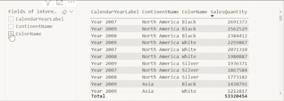
The following sections explain how to create a list of fields/a table containing three columns from three different tables and create the simple bar chart appearing in the animated gif above. The columns do not have to reside in the same data model table. Take a moment to digest this.
When creating my blog articles, I use sample data from the public MSFT demo dataset ContosoRetailDW. You will find this dataset here: ContosoRetailDW demo dataset
Selecting the columns / creating the list (the table)
The following screenshot shows the creation of the field list "Fields of interest" with three selected columns
- CalendarYearLabel (table: DimDate)
- ContinentName (table: DimGeoGraphy)
- ColorName (table: ColorName)

The black numbers mark the sequence of selecting the columns, and the red numbers denote the alphabetical order.
If you are wondering what the difference will be if you select "Numeric Range" in the "What will your variable adjust?" dropdown:
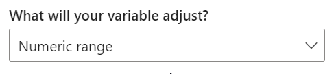
It's simply the "old" numeric range filter/slicer that will be created using the What-if parameters feature.
The same dialog will be used to create a list of categorical fields (like the one above) or a list of measures. Please remember that you should not mix categorical columns and explicit measures inside the same list. This will lead to unexpected behavior. For this reason, create lists that either contains categorical columns or explicit measures.
Using the list of fields (categorical columns and explicit measures)
Using the table created by the new dialog is easy. Depending on if the checkbox "Add slicer to this page" was active while creating the field list, a slicer might already exist on the current page. A slicer using the column "Fields of interest" has been completed. The mindful reader will realize that the column is named exactly as the table is named, and that is the name given in the above dialog.
The following screenshot shows the slicer

I assume that you are already aware that the "Fields of interest" table, created by the UI, is built with three columns with two columns hidden. But please wait until the next chapter, where the table is under closer examination.
Adding the only visible column from the table to a slicer is not that spectacular as it shows the column's content, but as soon as the column is added to an axis or legend, the magic begins. Add a numeric value to the visual, and you create a visual that allows the user to change the content of a visual easily.

Enjoy creating your own field lists and the combining of lists containing categorical columns and measures in the same visual 😊
the generated dax
I use DAX Studio whenever I want to trace and capture the DAX statements generated by Power BI. The subsequent three DAX statements show the DAX created to retrieve the data for the bar chart of the above screenshot. I highlighted the rows that are responsible for the query performance. I consider each statement as most simple/pure.
No column is selected inside the slicer
DEFINE
VAR __DS0Core =
SUMMARIZECOLUMNS(
'DimDate'[CalendarYearLabel],
"SumSalesQuantity", CALCULATE(SUM('FactSales'[SalesQuantity]))
)
VAR __DS0PrimaryWindowed =
TOPN(1001, __DS0Core, [SumSalesQuantity], 0, 'DimDate'[CalendarYearLabel], 1)
EVALUATE
__DS0PrimaryWindowed
ORDER BY
[SumSalesQuantity] DESC, 'DimDate'[CalendarYearLabel]
ColorName is selected
DEFINE
VAR __DS0FilterTable =
TREATAS({"'DimProduct'[ColorName]"}, 'Fields of interest'[Fields of interest Fields])
VAR __DS0Core =
SUMMARIZECOLUMNS(
'DimProduct'[ColorName],
__DS0FilterTable,
"SumSalesQuantity", CALCULATE(SUM('FactSales'[SalesQuantity]))
)
VAR __DS0PrimaryWindowed =
TOPN(1001, __DS0Core, [SumSalesQuantity], 0, 'DimProduct'[ColorName], 1)
EVALUATE
__DS0PrimaryWindowed
ORDER BY
[SumSalesQuantity] DESC, 'DimProduct'[ColorName]
CalendarYearLabel and ContinentName are selected
DEFINE
VAR __DS0FilterTable =
TREATAS(
{"'DimDate'[CalendarYearLabel]",
"'DimGeography'[ContinentName]"},
'Fields of interest'[Fields of interest Fields]
)
VAR __DS0Core =
SUMMARIZECOLUMNS(
'DimDate'[CalendarYearLabel],
__DS0FilterTable,
"SumSalesQuantity", CALCULATE(SUM('FactSales'[SalesQuantity]))
)
VAR __DS0PrimaryWindowed =
TOPN(1001, __DS0Core, [SumSalesQuantity], 0, 'DimDate'[CalendarYearLabel], 1)
EVALUATE
__DS0PrimaryWindowed
ORDER BY
[SumSalesQuantity] DESC, 'DimDate'[CalendarYearLabel]
The myriads of possibilities this new feature brings come with no performance penalty.
The field parameters table and some detailed observations
Here I will have have a closer look at the new table.
A closer look
When a field parameter table is created, the table has three columns by default. Even if DAX is used to create this table, it's important to understand that we have to use the UI to create the table. A table created by using
Modeling (menu) à New table (ribbon: calculations)
will not work.
The following DAX statement shows the "simple" table definition of "Fields of interest."
Fields of interest = {
("CalendarYearLabel", NAMEOF('DimDate'[CalendarYearLabel]), 0),
("ContinentName", NAMEOF('DimGeography'[ContinentName]), 1),
("ColorName", NAMEOF('DimProduct'[ColorName]), 2)
}
After the table is created in the data model, we can manually adapt the column name, the 1st column of the table, and the order number, the 3rd column of the table. The 2nd column is more interesting as the DAX function NAMEOF converts the object reference (the reference to a column) into a simple string. Here you will find a short explanation of the DAX function: NAMEOF
Until now, it's necessary to adapt the DAX code whenever we want to edit the table, either adding/removing columns to the table or changing the order of the columns. To be honest, I'm more than happy with this.
There is more that we can detect if we are looking more closely.
Some words of warning, the next paragraphs describe how I use Tabular Editor (Tabular Editor) inspect the table created by the Field parameter UI. TE is a powerful tool for everything related to Tabular models, but please remember:

(picture from here: WITH GREAT POWER COMES GREAT RESPONSIBILITY Poster | musayyadkhan | Keep Calm-o-Matic (keepcalms.com))
I’m using Tabular Editor 3 (Tabular Editor 3) whenever possible, also for inspecting Tabular models. You can observe the same things using TE2. If you are working in an enterprise that regulates installation of programs, you maybe can use the portable version of TE 2 that you find here (Release Tabular Editor 2.16.6 · TabularEditor/TabularEditor (github.com)). Many enterprises allow using portable versions as they do not require elevated permissions, e.g. the enterprise I’m working for considers using TE2 portable compliant.
I enabled the use of experimental Power BI features in TE. Experimental means: not all properties that can be edited for SQL Server Server Analysis Tabular or Azure Analysis Services models using TE SSAS Tabular models are currently supported by a Power BI dataset. Experimental does not mean TE does hacky things.
And even more important make sure that hidden objects are shown in the TOM explorer 😊 otherwise you will overlook interesting things as you are carried away by your excitement.
The next screenshot shows the table fields of interest, and the Extended property ParameterMetadata of the column Fields of interest fields :
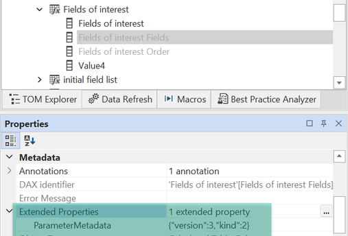
The existence of column Value4 in the screenshot above is explained in one of the next chapters, this column is not created by the UI.
If you are wondering about the property “ParameterMetadata” as you never have heard of this feature before, stop wondering.
ParameterMetadata is not a property that exists in a tabular model from the beginning instead it will be created during the development of the Tabular model. These properties then can be use by reporting tools who are aware of these properties, and can make use of them.
The next screenshot shows the property in more detail:

I consider the feature Field parameter as a dawning for many reasons. One is using Extended properties to control the behavior showing the values of a column instead of a simple string, controlling the composing of the DAX queries. For this reason I’m excited about what comes next. Until then I will explore what can be done using this feature.
Now, back to “regular” stuff that does not require 3rd party tools.
The order of field selection matters
Until today, it was impossible to capture the sequence of item selection inside a slicer. To be honest, it is still not possible to capture this sequence inside a DAX function. But, the sequence is tracked and matters. This becomes obvious by watching the following animated gif. The gif shows how the order of columns inside a visual is determined by the order the "columns" are selected inside the slicer. The gif starts with the initial order, meaning the order of how the columns are chosen during the initial creation of the field list. Then, ColorName will be selected, CalendaryYearLabel, and finally ContinentName.
Field parameters and composite Models
This chapter is to confirm that the feature works with composite models.
Assuming you have an Azure Tabular Model and reports connecting live to the Azure AS model, it’s simple to bring this feature to your reporting.
Convert the live connection into a DirectQuery connection and you can immediately create tables using the Field parameter feature in your local model. Of course this not just works with Azure Analysis Services models but also with a Power BI dataset.
The conversion is necessary as the feature requires the creation of a table.
Beyond the obvious
Users will never stop exploring the boundaries of a feature. My assumption, this feature will not be that different. The following three sections describe how this feature can be used beyond the obvious. The following sections will be fleshed out with future articles.
Adding columns to the list of fields table
It’s easy to add additional columns to the field parameters table:
Fields of interest = {
("CalendarYearLabel", NAMEOF('DimDate'[CalendarYearLabel]), 0), "this" ),
("ContinentName", NAMEOF('DimGeography'[ContinentName]), 1, "that" ),
("ColorName", NAMEOF('DimProduct'[ColorName]), 2, "this" )
}
Of course, additional columns have to be adequately renamed, but these columns can help to control (filter) the content of the slicer. Of course, this will immediately affect visuals using the "original" column.
The list of fields table and Row Level Security (RLS)
Basically, any column in the field parameters table can be used in combination with Row Level Security (RLS). RLS can help add or remove a specific level of details to our data visualization, depending on who uses the report.
Of course, this kind of implementation must not be compared with Object Level Security and is by no means a security feature. Because the field parameters table is not connected to any data model table, the data model will not become more secure.
Data driven data models
When you are reusing existing reports with different datasets it’s necessary that the underlying dataset adheres to some rules and it’s very likely that some aspects of the model are configured outside of Power BI, e.g., the name of tables and columns are described in SQL tables. Power Query then is creating the final model, not only extracting the raw data but also by creating tables inside the data model and renaming columns based on tables describing the source data.
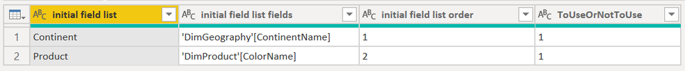
As the table that holds the list of fields is tagged inside Power BI and because this tagging comes with the creation of this table, you can't create this table programmatically using Power Query. But you can use the DAX command UNION to add rows of any table to the table created using the UI:
initial field list =
UNION(
{
("StoreKey", NAMEOF('DimStore'[StoreKey]), 0, "don't show")
}
,'field list PQ'
)
The following screenshot shows the content of the table "field list PQ:"
Maybe it is a good idea to create an additional column in the initial table called "ToUseOrNotToUse," with a value of 0. Then this column can be hidden in the slicer or on any visual using the table to control the content of the axis.
Field parameters and "Personalize visuals"
The feature "personalize visual" is different in that personalize visual is used when the report author wants to provide data exploration capabilities to the consumer of a report. The feature enables the consumer to change the content, e.g., changing the column used on an axis and the data visualization type itself. Personalize visual is a great feature but also demands some understanding of visual analytics concepts. The feature "Fields parameter" targets the report author, allowing the author to create reports where the consumer can change the content of visuals with ease. Assuming that the report author/creator is constantly communicating with the report's audience, new requirements can be implemented quickly.
some limitations
The need for a table
Using the UI creates a table inside the data model. In a world where we have to distinguish between the local and remote models whenever we face a composite model, it's essential to understand that the table representing the fields will be created in the local model. This also means that existing on-premises SQL Server Analysis Services Tabular data models will not be able to benefit from this feature.
I think that this feature will allow us to add analytical capabilities to reports being that huge, which makes migrating an on-premises tabular model at least a thought.
AI visuals
At the current moment (May 2022), the AI visuals are not supported by this feature. Hopefully, this will change with later versions of this feature.
I must admit that I'm eager to use this feature in upcoming Power BI projects. I'm hoping you will do the same!
Thanks for reading!
Kommentar schreiben
Soren (Montag, 22 Januar 2024 20:30)
Will there be any support for field parameters in SSAS models?
Tom Martens (Montag, 22 Januar 2024 22:10)
Hey Soren,
you can use Field Parameters with SSAS 2022.
Tom
Soren (Montag, 26 Februar 2024 13:43)
The documentation from MS says something else: https://learn.microsoft.com/en-us/dotnet/api/microsoft.analysisservices.tabular.groupbycolumn?view=analysisservices-dotnet#remarks
Check the comments from Daniel in this thread as well: https://github.com/TabularEditor/TabularEditor3/discussions/1100
Tom Martens (Montag, 26 Februar 2024 16:09)
Hey Soren,
you need SSAS AS 2022 because it's first version that allows you to "transform" the live connection into a direct query connection.
Doing that allows you to add a field paramters to your then "local" model. Because a field parameters table does need any relationships to SSAS 2022 tables (I consider these tables as the remote tables), there will be no performance impact.
Soren (Freitag, 01 März 2024 01:38)
I wouldn't call that 'supported by ssas / aas' since the deployed model can't include field parameters. But yes, with direct query you can build it in the local model. Do you know if this is possible on pbi report server as well?