The other day I stumbled across this tweet by Matthew Roche: "It must be pizza night!" The short conversation sparked by this tweet reminded me of a data visualization task in my current project.
Visualize the contribution of segments and make it easy to discover which segment's contributions are responsible for 50% of the total.
My first thought, hopefully, the rest of the project will be as simple as this task. I assigned the "part-of-a-whole" category to this task and went on to categorize the next task, drafting a data visualization that best fits the analytical requirement.
Data visualizations, at least most of them can be grouped by a main task they are aiming to tackle. These different tasks are beautifully visualized 😊 by Jason Thomas in his blog Financial Times Visual Vocabulary: Power BI Edition – Some Random Thoughts (sqljason.com).
This blog is about one visualization task. In particular, this task is called part-to-whole. Effective visualizations will reveal the contribution of a single item to the whole, as Claus Dieter Wilke calls this in his book "Fundamentals of Data Visualization": "… visualizing proportions … as part of the total".
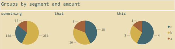
The solution for the above task looked similar to the one below; instead of pies, I used donuts, and I also did not use a color palette extracted from the color scheme of one of Wes Anderson's films:
Yes, you are right, pies should be avoided, so did I. Instead, I was using donuts, as I already mentioned 😊
Of course, neither the pie nor the donut chart is much respected throughout the data visualization community to map data to a graphical representation. From my understanding, all the aversion of pie charts or, to be more precise, the aversion of arcs can be rooted to the epic article of Cleveland/McGill, "Graphical Perception: Theory, Experimentation, and the Application to the Development of Graphical Methods." In this article, Cleveland/McGill find that arcs (the slice/the wedge) are not well suited to represent data.
Modern authors like Cole Nussbaumer Knaflic write, "Pie charts are evil." Do yourself a favor and read her book "Storytelling with data." I consider her book a great contribution to the data visualization community.
Nathan Yau, one of my favorite authors in the area of data visualization, is not that strict. In his book "Visualize this," he writes:
"You can use the pie chart without any problems just as long you know its problems. It's simple. Keep your data organized, and don't put too many wedges in one pie."
If you wonder how the tweet from above sparked this article – it's as simple as this: I consider the pizza dough the data and the topping the mapping of this data to aesthetics like shape and color. In this analogy, the pineapple is the arc (the slice/the wedge). The little dispute between Matthew and Alberto about pineapple being an adequate topping, meaning an adequate visual mapping, reminded me of what Nathan Yau and Cole Nussbaumer Knaflic wrote, which reminded me of my visual solution for the specific task I described above.
Why i use pie charts
The most obvious reason why a pie chart is a perfect fit is this: the arcs will be sized relative to their proportion of the total and automatically clockwise ordered from the largest arc to the smallest one. All Business Intelligence/Data Visualization tools and data visualization libraries I know (a little more than just Power BI 😊) are doing this without further ado.
You may consider using a Stacked bar chart or a 100% Stacked bar chart to tackle the above task. Even if both data visualization methods can visualize the proportion of the segments (a, b, c) for each stack (something, this, that), both can not solve this task. The screenshot below is showcasing both of the bar charts I just mentioned:
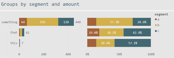
The simple stacked bar chart (left) just solves the 1st part of the task: visualizing the proportion of the segments. The same is valid for the 100% Stacked bar char (right)t.
Both bar charts fail to tackle the 2nd part of the task: visualizing the segments that are contributing 50% of the total.
A particular feature is needed to make it possible to quickly identify the segments that contribute 50% or more to each stack. If you look a little closer, you will realize that the order of the segments does not reflect the proportion of the segments in each stack.
For this reason, I use the 100% Stacked bar chart only if the segments have a natural order. Most of the time, alphabetical order is not the same as the natural order like months or low, medium, high.
Nevertheless, the stacked bar chart provides one great advantage compared to the pie chart or the 100% Stacked bar chart. It visualizes the absolute size. The pie chart takes a little while to notice that the group "something" is 64 times larger than the group "this." Even if the above task does not request this information, I tend to provide as much information as possible, as I'm a great fan of information density. Of course, I avoid obfuscating the primary communication with less important information or just throwing data into the chart.
The natural order of the arcs in a pie chart (or donut chart) makes it easy to identify the segments that provide 50% of the total. The following picture shows this by an overlay of a transparent semi-circle:

If you are thinking about pie charts as a graphical representation for data and try to avoid some dubious shortcomings, you will discover advantages and, of course, disadvantages. If you start arguing that it will be difficult to tell if a specific arc is smaller or larger than another arc, you are correct. Cleveland/McGill taught us that we are not good at distinguishing arcs.
But we also have to remember that as soon as we start decoding our data into graphical representations (the charts), we immediately begin to neglect accuracy. Edward Tufte once wrote, "Tables are clearly the best way to show exact numerical values, …" (Edward Tufte, The Visual Display of Quantitative Information 2nd Edition, 2001).
How i will solve the task in the not-so-distant future
I have to admit that I was emotionally struggling with my pie-based solution. In addition to that, the bar chart (stacked or not) is one of my favorite visualization types, but I'm also aware of its disadvantages
- Alphabetically ordering, instead of the value-based ordering of the segments in each stack
- Lack of any visual clue to mark the 50% of a stack
I'm pretty sure about two things,
- This blog is one of the 1st blogs, if not the 1st mentioning the Deneb custom visual. Daniel Marsh-Patrick is currently working on a custom visual called Deneb (I agree with you, dear reader, the name is not that promising). This visual will change a lot in the realm of custom data visualization. If you do not know Daniel, here you will find Deneb and his other fantastic work: State of (My) Visuals - Dec 2020 | coacervo.
- This blog will no be the last.
I can't remember the exact circumstances, but the other day I was invited by Daniel to test out a preview version of Deneb.
Maybe I'm over-simplifying, but Deneb provides a custom visual where we (the visual designer) can enter vega/vega-lite JSON-based specifications. Some magic happens. The visual renders the data, and the chart appears. Voila!
My dear Power BI friends, this is so cool.
I consider vega/vega-lite one of the most powerful data visualization libraries available. Here you will find some examples: A High-Level Grammar of Interactive Graphics | Vega-Lite
The spec (cool vega-lite jargon) below:
{
"$schema": "https://vega.github.io/schema/vega-lite/v4.json",
"width": 800,
"height": 200,
"datasets": {
"$dataset": [
{ "group": "a", "segment": "this", "amount": 1 },
{ "group": "a", "segment": "that", "amount": 2 },
{ "group": "a", "segment": "something", "amount": 4 },
{ "group": "b", "segment": "this", "amount": 8 },
{ "group": "b", "segment": "that", "amount": 16 },
{ "group": "b", "segment": "something", "amount": 18 },
{ "group": "c", "segment": "this", "amount": 64 },
{ "group": "c", "segment": "that", "amount": 256 },
{ "group": "c", "segment": "something", "amount": 128 }
]
},
"data": { "name": "$dataset" },
"autosize": { "type": "fit", "contains": "padding" },
"transform": [
{ "calculate": "datum.amount * -1", "as": "segmentOrder" },
{ "calculate": "datum.amount * 0.5", "as": "thepoint" }
],
"resolve": { "scale": { "color": "independent" } },
"layer": [
{
"mark": { "type": "bar", "tooltip": true },
"encoding": {
"x": { "field": "amount", "type": "quantitative" },
"color": { "field": "segment" },
"order": { "field": "segmentOrder" }
}
},
{
"mark": {
"type": "point",
"shape": "triangle-down",
"size": 250,
"filled": true,
"stroke": "black",
"strokeWidth": 1,
"fill": "red",
"yOffset": { "expr": "-bandwidth('y')/2" }
},
"encoding": {
"x": {
"aggregate": "sum",
"field": "thepoint",
"type": "quantitative",
"stack": "zero"
}
}
}
],
"encoding": { "y": { "field": "group", "type": "nominal" } }
}
Creates the chart below:

To be clear, using the custom visual inside Power BI, the visual passes the data to the JSON specification automatically. I created the above specification if you want to try the vega-lite editor.
As far as I know, Daniel will open up Deneb during his presentation "Bringing Visualisation Grammar to Power BI" at the Power BI Summit this April. Here you can register for the Summit: https://globalpowerbisummit.com
WHY I love arcs
If you now think that I don't like pineapple, you err. I love pineapple, but I tend to eat most of the pizza without it.
Nevertheless, one of my following blogs will be about Harvey Balls, some kind of pineapple:

Thank you for reading.
Enjoy Easter, stay safe, stay healthy, and rock your data
Kommentar schreiben